Every year, NBA teams make an effort to keep things fresh and new by adding a new design to their jersey/court lineup.
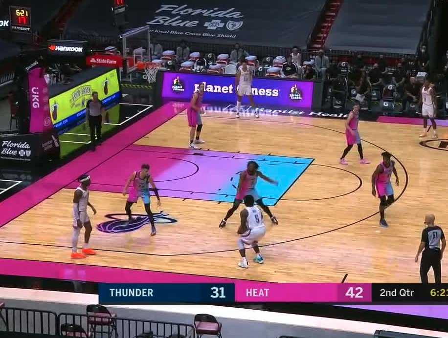
For the Heat, their classic “Vice City” color scheme received a pretty ambitious revamp this season that looked pretty decent on paper. Unfortunately, it doesn’t look nearly as good in action, and the NBA media was quick to take notice.
The Miami Heat's new jersey/court combo is something else 😲 pic.twitter.com/c2vczcXFug
— ESPN (@espn) January 5, 2021
With a clear and overwhelming rejection of the design, fans absolutely flamed the Heat for the eyesore on Twitter, responding with jokes and harsh criticism.
Wait pic.twitter.com/mOwVxAWlMH
— vic (@CountOnVic) January 5, 2021
Looking at those jerseys like pic.twitter.com/iHTeVW707f
— NAT£ (@justnate_23) January 5, 2021
Not gonna lie.. Loved the uni in pictures.. Buuuuut upon further review on the court, the execution isn’t there. Dang I was looking forward to these
— Darian Cunningham Jr. (@DeeRayCJ) January 5, 2021
they said pic.twitter.com/oKnei3pzG2
— Ben Bullock (@benbullock_) January 5, 2021
It's pretty bad lmaoo
— Hakeem Burner (@hakeemburner) January 5, 2021
https://twitter.com/zachwilsontime1/status/1346267725014978560
Out here looking like Trix Yogurt pic.twitter.com/VQ4oTakG0s
— Raulin Platt (@RaulinPlatt) January 5, 2021
Nah this shit is horrible LMAO
— Mo (@LamarHeisman) January 5, 2021
Credit has to be given to the Heat for coming up with such a bold and unique idea, but it just doesn’t work on the court. The collision of the colors on the jerseys just looks wrong, as does the court.
It looks like they’ve found that out the hard way.
But, hey, there’s always next year.